Open Source SVG Map to show cities and regions #1652
Comments
|
This was mentioned in #1514. |
|
This should be implemented in the next few weeks. |
|
So, I will start the map development in the next days. There are a couple of things to do:
However, there are some open problems.
|
|
Attachment: A mockup of the new city view |
|
Attachment: A mockup of the new region view |
|
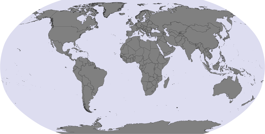
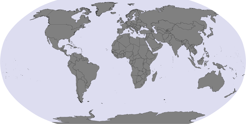
Note, in this image you can see an overview about all available region outlines. Think this is pretty much complete. |
|
Greg, great news that you will resume work on this :) GADM data looks good and there for all countries, this sounds fantastic, nice find!
It is possible to run a script on every GeoIP update, but not a good solution for ease of use. Here is a proposal: Maybe, we could run the script once before Piwik release (and commit the file to SVN after checking it's OK). We would use the latest GeoIP database for this. Then, if users use an older version (or newer version) compared to the pre-generated DB, maybe they could run the script manually themselves? But, I would like to ask about this script, what exactly will it map? My current understanding is that Piwik will report:
Is the algorithm designed to map "regions" according to GeoIP, to "regions" in the Piwik map? I guess that, for each GeoIP region, we could give one lat/long of a city belonging to this region. If so, do we need a database for this, maybe the SWF could map in real time the lat/long to the pixel inside the region? Thanks for claryfying |
|
Replying to matt:
I didn't knew that the GeoIP DB contains a complete list of fips regions. So Piwik already knows how many visitors each region had? In this case, there's no need for another update script. Now, all I have to assure is that the map region ids are the same as the GeoIP/FIPS region ids. Just to make sure I understand everything, here's a sample request flow:
Did I got it right? Thanks |
|
Yes it sounds good! One other feedback, would be to give labels to the icons to switch to city/region view, and to the button to zoom in/zoom out, since these buttons are very important and must be easy to reach. I think that we must check that GeoIP data will output the regions as we expect them, ie. that all visitors are indeed assigned in one of the regions listed in: http://www.maxmind.com/app/fips10_4 I will double check this and confirm here. Is there any other open question appart from this one? |
|
Greg, will the Flash maps know about all cities in the GeoIP Database? Or, will the flash map expect a list of cities & lat/long, and plot them "blindly" in the flash map (projecting from lat/long to pixels, and drawing City name based on Piwik API as input) ? |
|
The flash map doesn't know anything about the cities. Instead the map is able to project lat/lng coordinates to the exact pixels. I'm not sure if it will display all cities "blindly", maybe there will be some simple clustering of cities that are very close. |
|
One thing I think of, is that sometimes GeoIP will not return region/city info (or just, not city some other time). So, maybe we can plan to display the "Unknown" on the map somewhere, discreetly? Because, I guess the % displayed, will take into account the % for the Unknown region/city? |
|
You mean that for some visitors GeoIP only knows the country but not the city and/or region? We can add a "Plus X unlocatable visitors" text somewhere to display this data. Good point. |
|
Yes, we better expect the worst with geoip free edition, all use cases can happen. I think Piwik will return, for a country's region, the 'Unknown' (or 'Other') row that will contain these. simple text "X visits couldn't be located" sounds good! |
|
Sorry, I'm late joining this discussion. I'm going to add a FIPS data file as part of my work in #1823 to convert the region names into the more compact FIPS 10-4 code when storing it in the log_visit table.
re: the MaxMind FIPS file
|
|
Partial feedback:
|
|
Just wanted to let you know that I've got plenty of stuff to do right now. Hope to be able to continue working on this feature soon. Sorry for the delay.. |
|
I have just seen an interesting project: jVectorMap for canvas+JS Map library. Greg, what do you think about this work? |
|
Hi Matt, jvectormap looks quite nice. I'm currently thinking a lot about JS/SVG based mapping myself, even developed some early prototypes while working on other projects. Still, our biggest challenge is how to build the map data files for every country (including admin level2 regions). Thus, one of my next steps is to setup a Mapnik server and let it export clean SVG projections of shapefiles. My goal is to do that by writing as less code as possible. Mapnik is such a powerful library, so it should be almost only a matter of configuration. After we created the map files, we still have the choice to either use one of the currently emerging JS/SVG mapping libraries (like jVectorMaps) or to develop a mini library especially for Piwik by ourself. Besides of that, I fully agree on JS/SVG instead of Flash. Quite a challenge, but possible. and, yes, my work load starts getting better. :) |
|
Greg, I'm happy to hear you are keen on SVG for your own work. As you may have seen in the blog recently, we are now using canvas graphs only, and Timo from the team has contributed many patches to jqplot to make it work nicely in our use case. Hopefully, an existing library can meet our needs in terms of performance, maintainability, features, licensing. In any case this work will be reused, not only in Piwik but I'm sure in hundreds of other projects in the future, since we are building the first truly open source world mapping with region details for all countries. With shapefiles, I hope you can find a format that is of low size and with good shape quality, that must be quite a challenge. |
|
Once the Maps show cities and region, we definitely have to show the maps in the actual Country report: full awesomeness! see #1821 |
|
See also the blog post by greg: http://vis4.net/blog/posts/piwik-maps-2/ |
|
I now proceed with this task. As a first step, I looked at the shapefiles provided by gadm.org. Since some people seem to be very interested in my work (I got plenty of mails after finishing the first version of the map), I decided to blog about my progress. I will post the links in here. Part 1: Finding a map data source: |
|
Greg; excellent first step, looking forward to the next part! |
|
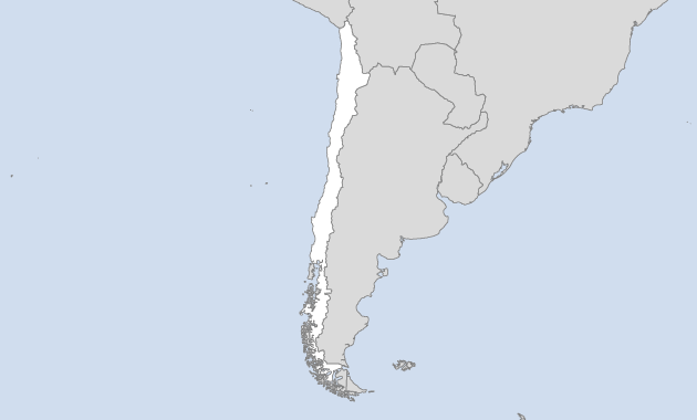
Regarding the simplification of shape files, it is obvious that we don't need any detail around Chile, a rough outline of the coast would do perfectly (we can't affort all the little islands ;). Also is it possible to add a test not to plot islands less than 10 square km, or something similar? It is really key for user experience to have the smallest file size possible to ensure fast downloading and JS parsing / CPU usage. :) |
|
I just looked into a world shapefile and computed the areas of all 3761 polygons (a country may have multiple polygons for islands etc). Filtering every polygon smaller than 10 square km would remove 434 polygons (=11%). I checked the names of the countries which the removed polygons belong to and found many island states among them (as expected). However, I think a hard cut at 10 sq km has some problems:
See sample rendering. I tried a different rule: remove all polygons smaller than 5% of the maximum polygon area of that country. Since the maximum area of the Maldives is 9sqkm, all islands are kept, while all small islands of the USA are removed. Also this halved the resulting SVG file size keeping the map correct in terms of includedness of countries. See sample rendering. However, removing every polygon smaller than 5% of the maximum per country is not satisfactory as well. Big and also well-known islands like Hawaii or Novaya Zemlya shouldn't be removed in my opinion. Also there is a problem with those tiny islands countries like the Maldives, which is obvious if you look at the zoomed view on the Maldives. The islands are way too small to be rendered in a meaningful way. This leads to some important questions: Does the map needs to include all countries or is it acceptable to ignore some countries, like the Maldives Islands? In the old map widget this wasn't important because there was no country level view. |
|
I think would like to keep islands and outlying regions in the country-level views. For instance, I could try to generate composed maps that mix different projections to fit the complete country into the map. Like in this example for the United States. |
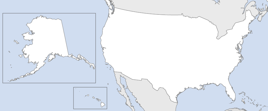
|
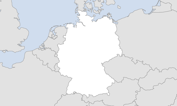
One note regarding the projection used for the country-level views. I would like to simplify the whole thing by using the same projection for every country, but with different parameters (namely the projection center). One of the simpler projections is the orthographic projection, which looks the same as if looking onto a 3D globe. This gives quite good and less-distorted views for almost every country. The only country that looks quite distorted is Russia. Because of it's huge area, Russia takes too much space on the globe. You can have a look at distorted Russia here. My opinion is that this distortion is acceptable given the simplicity of rendering maps in a single projection. In an ideal mapping world, one would use specialized projection for every country, like the New Zealand Map Grid for New Zealand etc. Any more opinions? |
|
The next design decision has to do with the aspect ratio of the maps. At some point in the map generation process I need to crop the country-level maps to a bounding box. The idea is to fit the countries as big as possible into the views while also showing a bit of their neighbour countries for navigation. Now the question arises to which aspect ratio the maps should be cropped. As far as I see do we have to options:
|
Sounds good
Removing countries all together is I think not a good idea. Maybe we could still display ALL countries, but leave the rule of 5% for all other countries. (eg. Maldives would be displayed with at least the main islands (if possible..), while canada would still lose many big islands.
If you can do that (at least for some selected countries?), it would be pretty cool!
Simple is always better, even if the shape is not perfect. We could improve this later anyway. What would it look like for NZ? ;-)
Also, maybe it would useful if hovering over the countries next to the zoomed country, would display a little tooltip with the Country metrics. Maybe it could be displayed next or below to the main country metrics (which would always be displayed?).
Agreed. I think it is expected that all country zooms have the same dimensions. dashboard doesn't support dynamic size widgets at present (not planned). The dynamic aspect ratio could be implemented later in the lib for static country-specific maps... Thanks for posting your thoughts and log here, cheers! |
|
Just added
|
|
Added fake display for regions and cities (100 randomly chosen). Also the widget now remembers the country/continent and the view mode (region/city). Test it live: |
|
Beautiful & Amazing work!! :-) after 1 hour testing I found some bugs and have a few questions:
Here is my UX review & feedback:
I believe with all these improvements the usability and ease to understand the map will be much improved. Did you have other ideas as well and/or does it sound good? |
|
(In [7173]) filter_pattern= will now work on metadata columns. This will be useful for example, if we wanted to select only a number of "countries", from the UserCountry.getCity API, we could do the following: &filter_column=country&filter_pattern=de|fr|es|it|nl |
|
(In [7498]) Fixing some tests, also adding <city>xx</city> to tell unknown cities from others, as requested by Greg Refs #1652 |
|
In #3585 I added a new parameter &showRawMetrics that will return all raw metrics in the API metadata getProcessedReport call. |
|
(In [7643]) deleting the map plugin not working and will revert to previous version Refs #1652 We are starting crowd funding for this feature! Participate in this fantastic project by donating at: http://crowdfunding.piwik.org/analytics-maps-world-country-city-region/ |
|
(In [7644]) Refs #1652 Maps |
|
We need YOUR help! We are running a crowd funding campaign to raise funds to implement the detailed Visitors Maps of Countries, Regions and Cities (for all countries)! These maps will be beautiful, usable, and built using open standards SVG+JS. They will show detailed visitor count, conversion rates, by Country but also (New!) by city and region. Pledge now at: http://crowdfunding.piwik.org/analytics-maps-world-country-city-region/ Piwik needs you! |
|
js/vendor/kartograph.is has conflicting licenses GPL and LGPL. js/vendor/kmeans.js is missing any sort of attribution/license. PiwikMap references in LEGALNOTICE should be removed. Remove swfoject per #3666. |
|
@vipsoft, all fixed now! |
|
Real time Visitor Map and aggregated World map + Countries + Regions + Cities were released in Piwik 1.11! |
UPDATE! Fund this project now to help us finish the work and release the feature!
It takes 2 minutes: http://crowdfunding.piwik.org/analytics-maps-world-country-city-region/
Right now the world map only shows which country the visits are coming from. It would be really great / useful if we could narrow it down to what state the visitor came from or even which city. Like in the Google analytics.
It'll be a great feature for marketing so we know where most of the visitors are!
We would like to also move the technology from Flash to full open source stack, and have the map displayed in SVG or Vector.
Once the Maps show cities and region, we definitely have to show the maps in the actual Country report: full awesomeness! see #1821
Once implemented we should remove SWFobject lib: #3666
The text was updated successfully, but these errors were encountered: